Social Privacy Manager
Overview
Team: 2 UI/UX Designers, PM, PgM, Content, Marketing, Research, Eng. team, Legal
Role: UI/UX designer
Problem
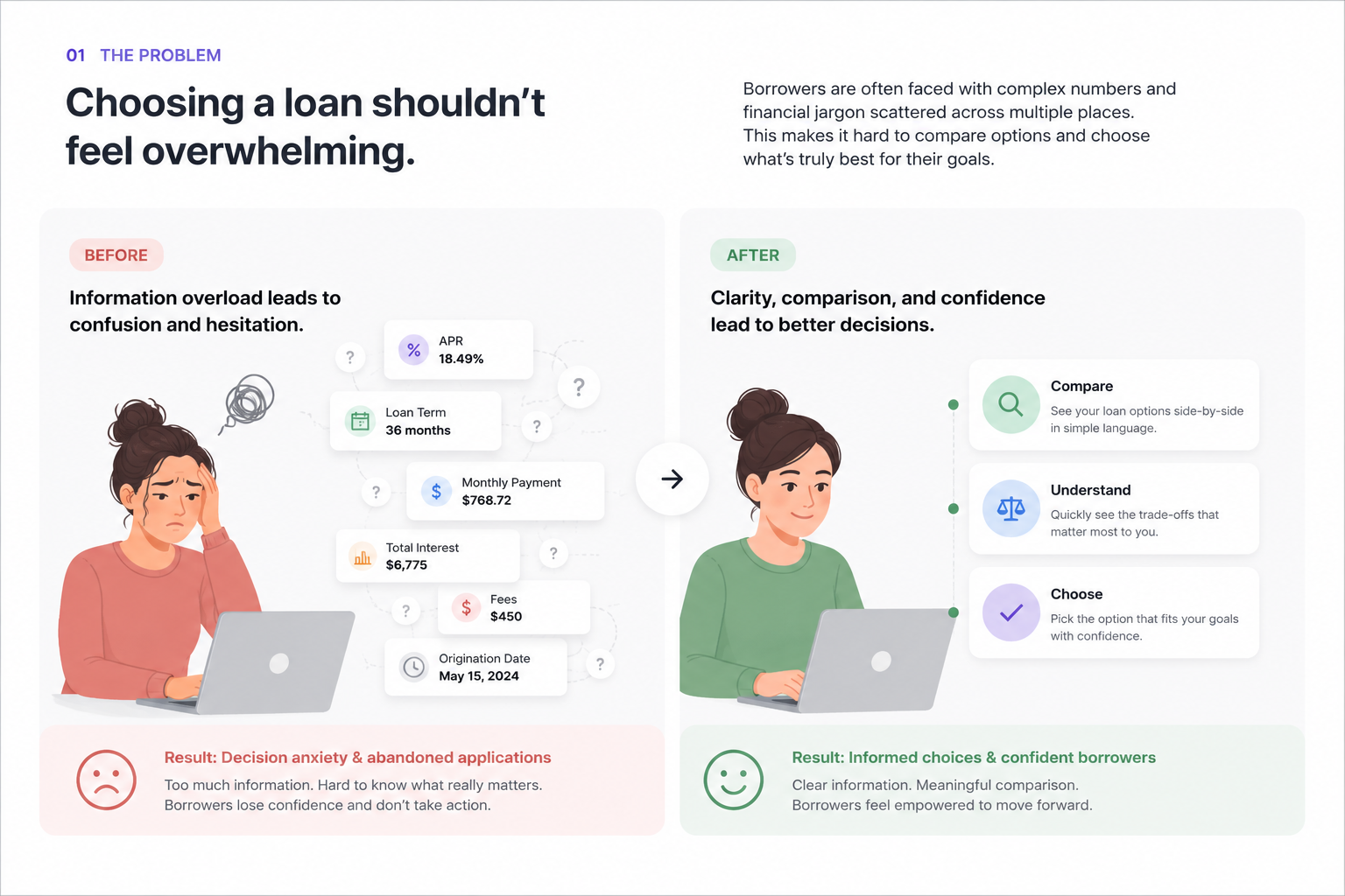
Managing privacy settings across social platforms is complex and often unclear. Users don’t always understand what they’re sharing or how exposed they are, which leads to confusion and low engagement with privacy tools.
Solution
Designed a guided experience that analyzes connected social accounts and surfaces key risks in a clear, actionable way. Focused on simplifying complex information and helping users take meaningful action without feeling overwhelmed.
Impact
30% of users downloaded the feature, with 20% taking action on recommended privacy settings, showing improved clarity and trust in the experience.
Approach
The goal was to help people understand what they’re actually sharing on social media and make changes without feeling overwhelmed.
Framing privacy as decisions, not settings
Most people don’t think in terms of privacy settings. They think in terms of outcomes, like who can see their posts or what information is public.
Instead of exposing raw settings, I focused on turning that complexity into a set of decisions. The system analyzes connected accounts and surfaces what matters in a way that’s easier to understand.
Simplifying how risk shows up
Early concepts leaned toward showing more detailed data, but that quickly became hard to scan and even harder to act on.
I moved the design toward a simpler approach that highlights the most important risks first. Each issue is presented as a scannable card with a short explanation, so users can quickly get a sense of what’s going on without digging through everything.
Making it obvious what to do next
Understanding a problem doesn’t help much if you don’t know what to do about it.
Each insight is paired with a recommended action and a clear next step. The goal was to remove guesswork and make it easy for users to move from “something feels off” to actually fixing it.
Structuring the experience as a flow
Rather than treating this as a set of separate screens, I designed it as a guided flow:
- Connect a social account
- Analyze current settings
- Surface key risks
- Take action
Breaking it into steps helped make the experience feel more manageable and kept users moving forward.
Designing with real constraints
As the feature moved into development, edge cases and technical limitations started to show up.
I worked closely with engineering to adjust the design without losing the overall direction. That meant refining states, reworking layouts, and making sure the experience held together as things got more complex.
Iterating toward something that feels usable
We explored a range of directions, from more detailed views to more stripped-down versions.
The final direction focused on making the experience easy to scan, easy to understand, and easy to act on. That shift made a noticeable difference in how people interacted with the feature.

Results
30% of users downloaded the feature, with 20% taking action on the recommended privacy updates.
The biggest shift was in how users interacted with the experience. By focusing on what mattered and making next steps more obvious, more people followed through instead of dropping off.
Moving away from data-heavy views and toward a more guided approach made the feature easier to use and led to stronger engagement overall.