Family OS
Overview
Family OS is a mobile-first planning app designed to help busy parents manage the day across school schedules, activities, household tasks, meals, and family priorities.
The project started from a real problem I experienced as a working parent: family life was being managed across too many disconnected tools — calendars, school emails, text messages, reminders, notes, and memory. While existing tools helped store information, they did not always help parents answer the most important daily question:
“What needs my attention today?”
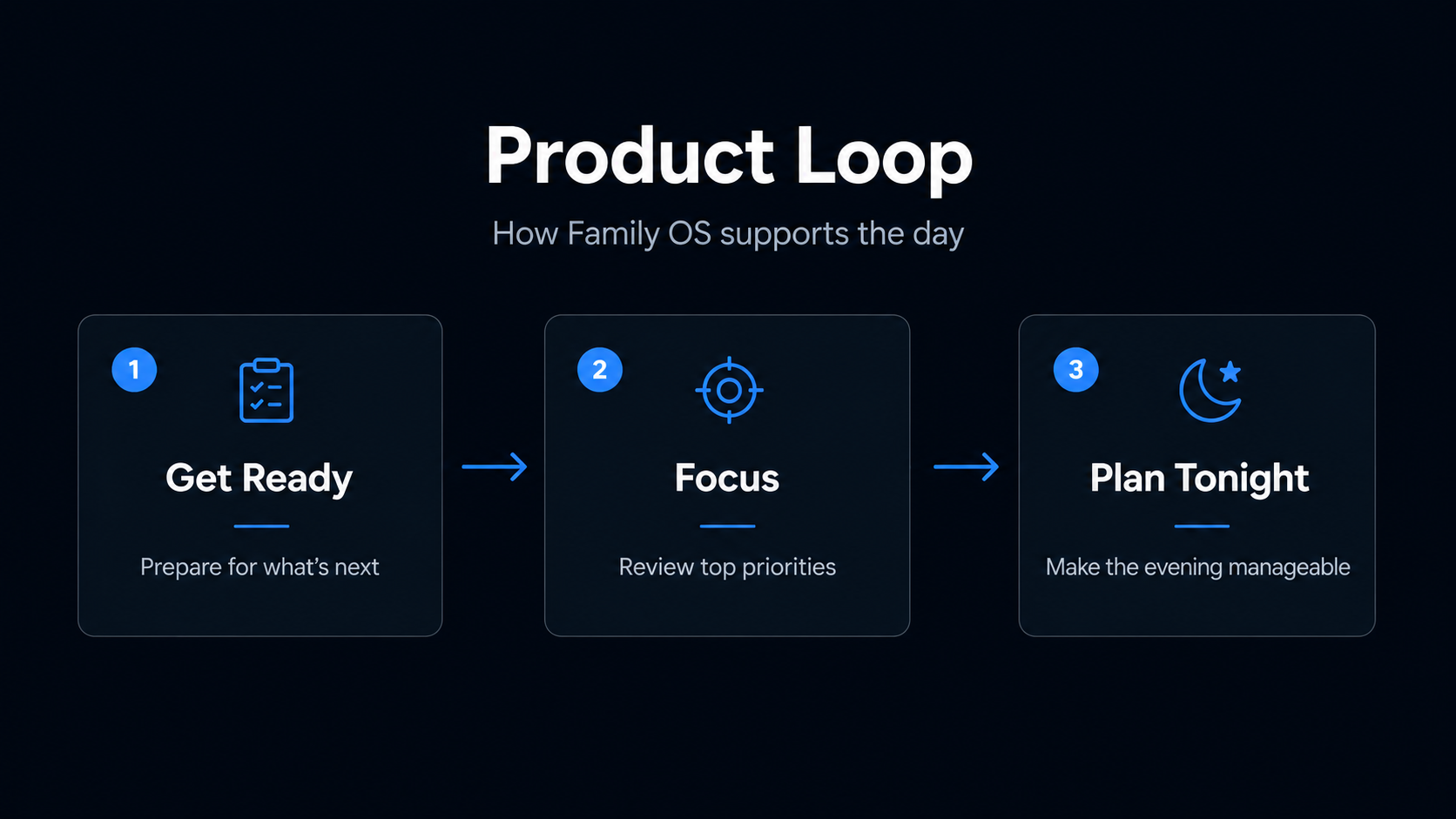
I designed and built Family OS as a 0→1 MVP to explore whether a single daily dashboard could reduce the mental load of family planning. The final MVP focuses on three core actions: getting ready for what’s next, focusing on today’s priorities, and making the evening easier.
My role covered product strategy, research synthesis, UX design, visual design, prototyping, AI-assisted build workflows, MVP scoping, and usability testing.
Approach
I approached Family OS like a real 0→1 product, starting with problem definition before jumping into UI.
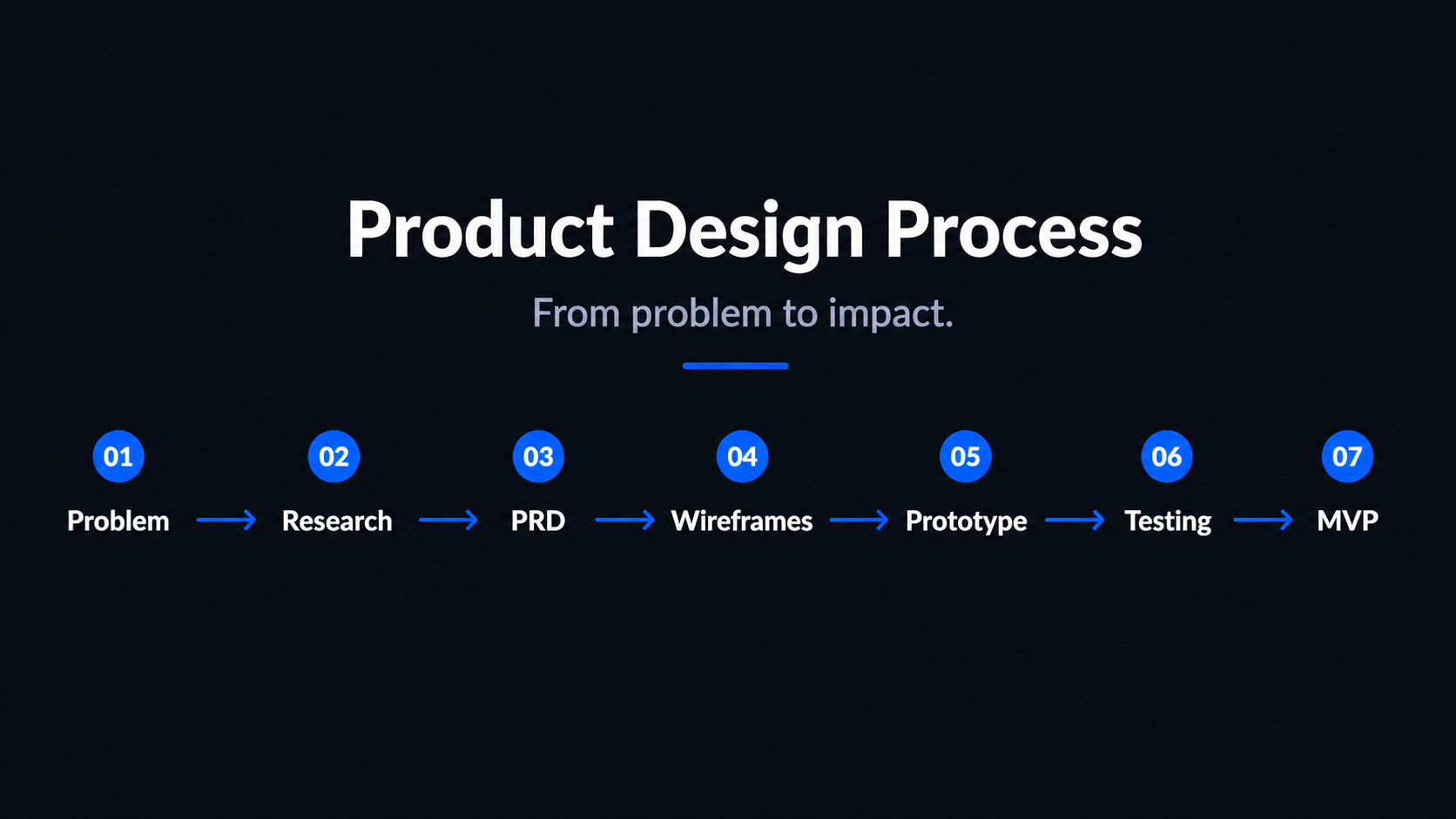
First, I analyzed how busy parents currently manage family life across tools like calendars, notes, reminders, school apps, text messages, and paper planners. The biggest insight was that parents were not lacking tools — they were overloaded by disconnected tools.
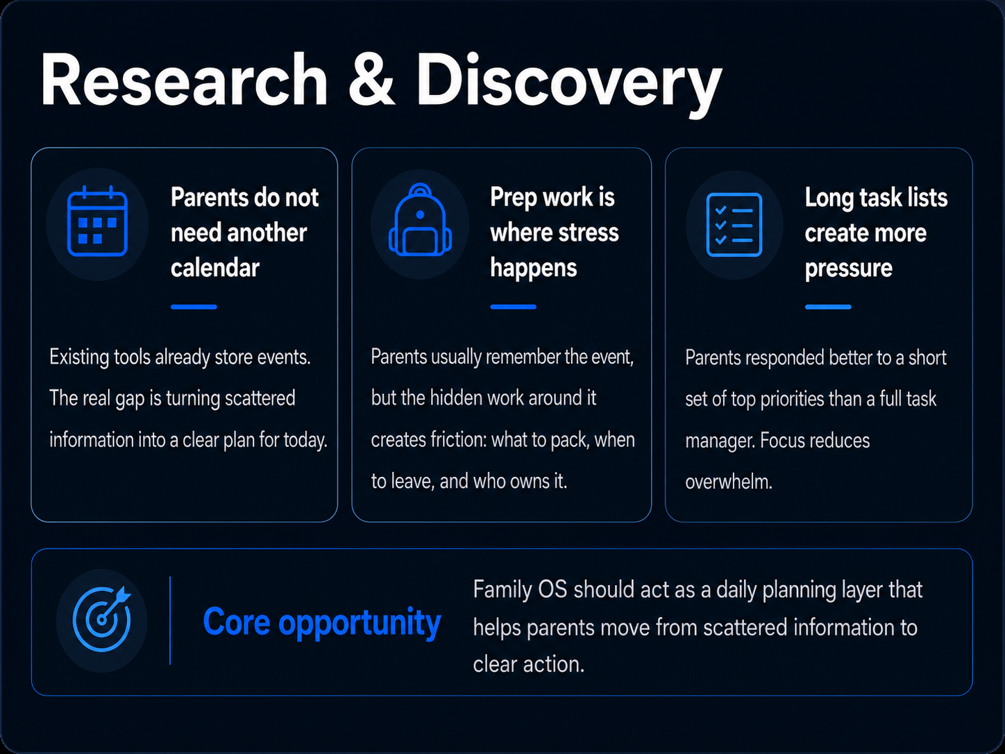
Most existing tools helped parents store information, but they did not help them quickly answer: What is happening next? What needs to be prepared? Who owns it? What matters most today? What can wait?
From there, I defined the MVP around one core job: help a parent quickly understand and manage today.
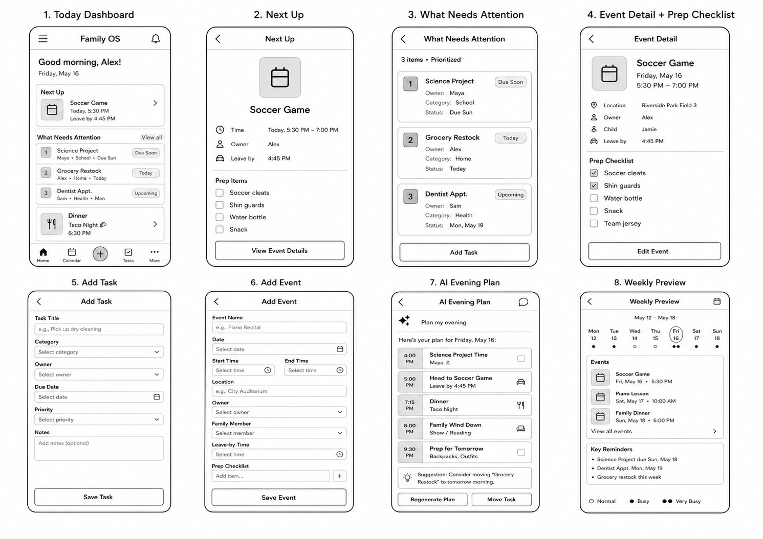
I created a PRD, mapped the core user flows, and designed low-fidelity wireframes around the main daily loop.
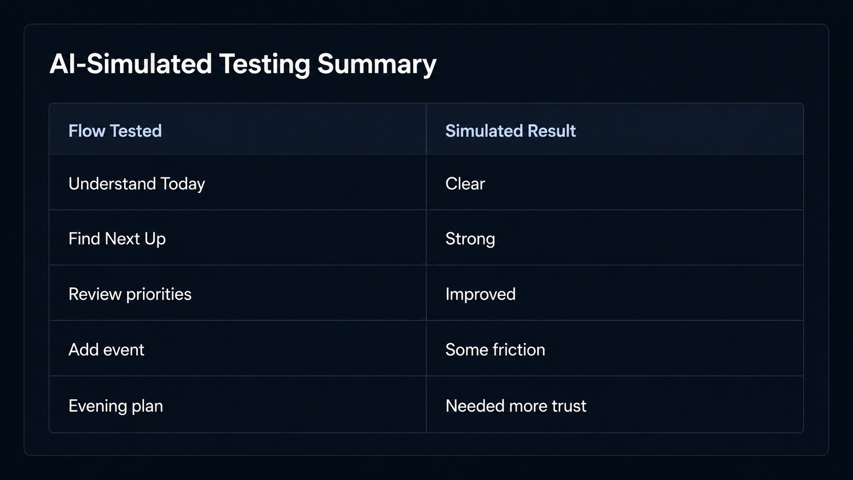
Before recruiting real users, I used AI-simulated usability testing to stress-test early flows against realistic parent personas. These simulations helped me evaluate whether parents could understand the core loop, find the next event, review priorities, add tasks, and use the evening planning flow. I treated these findings as directional inputs, not a replacement for real user testing.
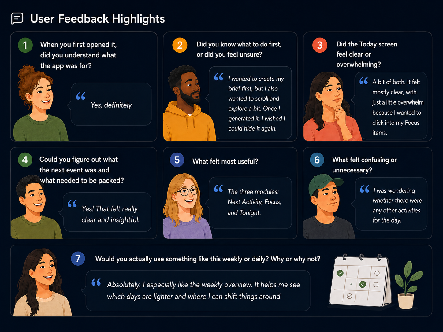
After building the MVP, I tested it with real users. That round revealed a more important usability issue: while the product idea was useful, the interface felt overwhelming. Users said there were too many words, the cards looked too similar, and they were not always sure what action to take first.
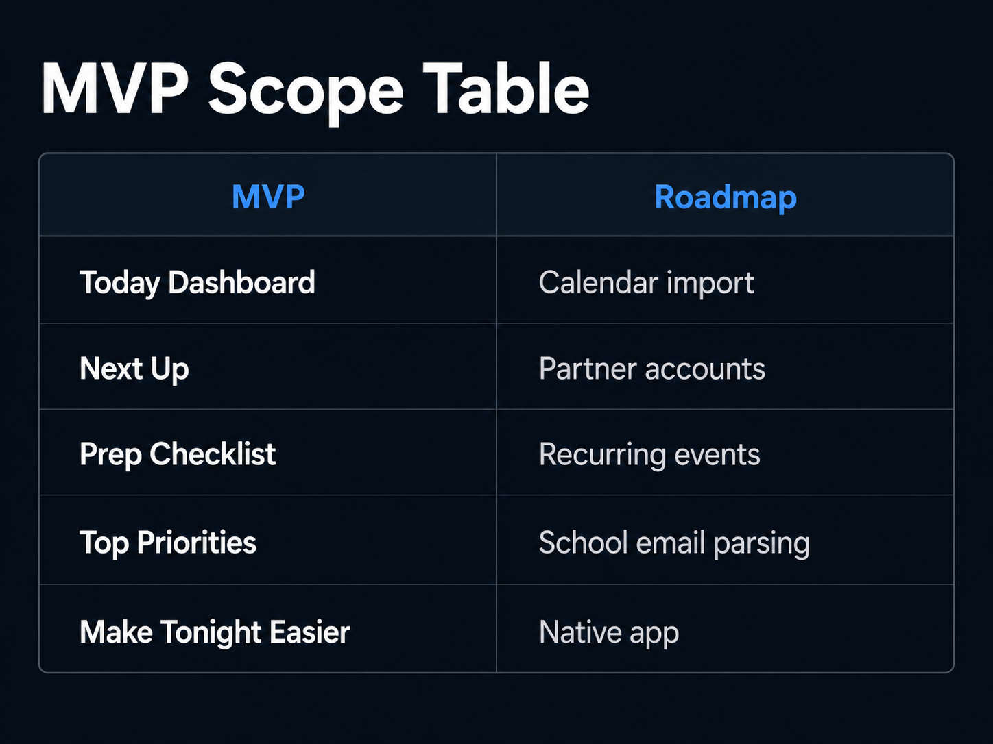
In response, I simplified the dashboard from multiple competing sections into three distinct cards: Next Up, Focus, and Tonight. I reduced copy, created clearer card hierarchy, added onboarding guidance, and made the primary action more obvious: Get ready for what’s next.
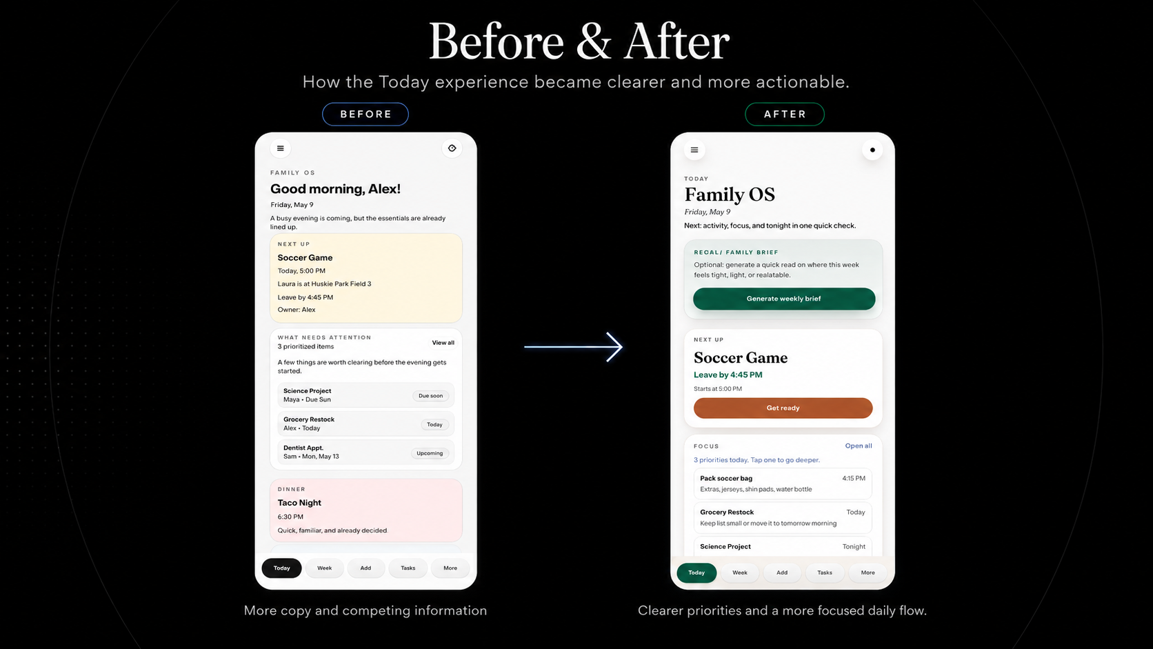
The final MVP prioritized focus, reduced cognitive load, and positioned Family OS as a daily planning layer rather than another calendar or task manager.
Results
The final MVP helped validate a clearer product direction for Family OS: the app is strongest when it helps parents quickly understand what to do next, not when it tries to become a full calendar or task manager.
Through AI-simulated usability testing and real user feedback, I refined the product around the moments that created the most value for busy parents: getting ready for the next event, focusing on today’s priorities, and making the evening feel more manageable.
Key outcomes:
- Designed and built a live mobile-first MVP from concept to deployment
- Created a full 0→1 product process including research, PRD, wireframes, high-fidelity design, MVP build, and usability testing
- Used AI-simulated usability testing to stress-test early flows before recruiting real users
- Identified Next Up as the strongest core feature, combining event details, leave-by time, owner, and prep checklist
- Validated that parents responded most strongly to features that helped them act quickly, especially knowing what to pack and when to leave
- Improved Top Priorities to help parents focus on the few things that matter most today
- Used real user feedback to simplify the dashboard after users said the app felt overwhelming, word-heavy, and visually repetitive
- Reduced the home experience into three clearer actions: Get ready, Focus, and Plan tonight
- Reframed Family OS from a family calendar into a daily planning layer for busy parents
The biggest product insight was that parents did not need another place to store information. They needed a tool that helped them move from scattered information to clear action.
The final MVP focuses on helping parents answer three questions quickly:
- What is happening next?
- What do I need to prepare?
- What can wait until later?
This helped shape the final product direction: Family OS should open directly into action and help parents reduce mental load, not add another system to manage.